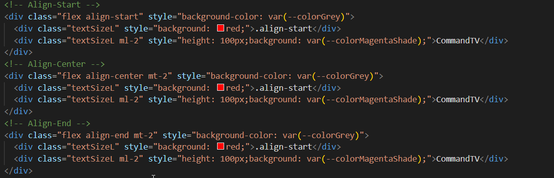
Justify Content
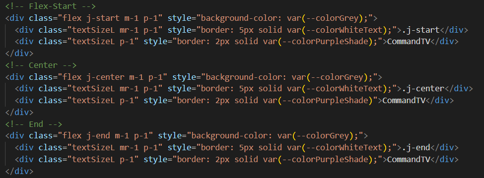
.j-start
CommandTV
.j-center
CommandTV
.j-end
CommandTV

Welcome to Our Pattern Library,
Explore our design guidelines and components for building a beautiful web application
Get Started
Barlow is a clean, modern, and readable sans-serif typeface. Easily customized with multiple weights and sizes, as shown below, for flexible use.
We have four different font weights. 'Light', 'Regular', 'Semi-Bold', and 'Bold'. This styling can be added by using the class selectors below.
                              .weight300 {
                                  font-weight: 300;
                                }

                                .weight400 {
                                  font-weight: 400;
                                }


                              .weight500 {
                                  font-weight: 500;
                                 }

                              .weight700 {
                                  font-weight: 700;
                                 }
This is xs light text. This is xs regular text. This is xs semi-bold text. This is xs bold text.
This is s light text. This is sm regular text. This is sm semi-bold text. This is sm bold text.
This is md light text. This is md regular text. This is md semi-bold text. This is md bold text.
This is lg light text. This is lg regular text. This is lg semi-bold text. This is lg bold text.
This is xl light text. This is xl regular text. This is xl semi-bold text. This is xl bold text.
This is xxl light text. This is xxl regular text. This is xxl semi-bold text. This is xxl bold text.
--colorPrimaryPurple
#3B118D
--colorSecondaryMagenta
#B21666
--colorAccentPink
#C33C96
--colorPurpleTint
#7658AF
--colorMagentaTint
#C95C94
--colorPinkTint
#D577B6
--colorPurpleShade
#290C63
--colorMagentaShade
#7D0F47
--colorPinkShade
#892A69
--colorBlack
#050505
--colorDarkGrey
#222222
--colorGrey
#7F7F7F
--colorLightGrey
#EEEEEE
--colorWhiteText
#FAFAFA
--colorWhiteText
#FAFAFA
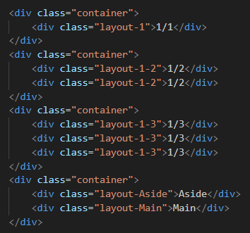
Page layouts structure and organize content, ensuring a legible and user-friendly navigation throughout the website.
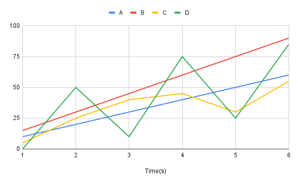
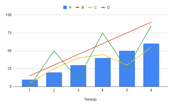
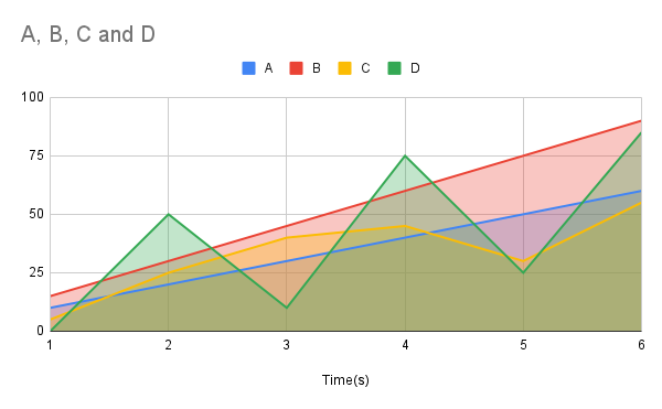
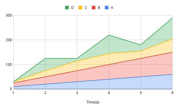
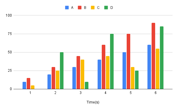
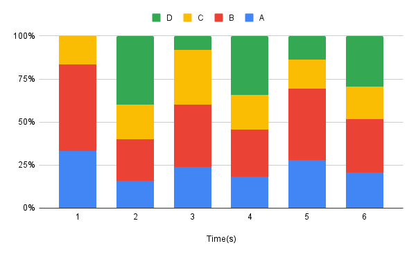
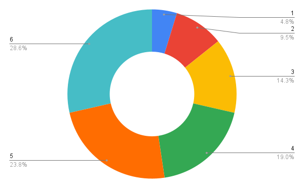
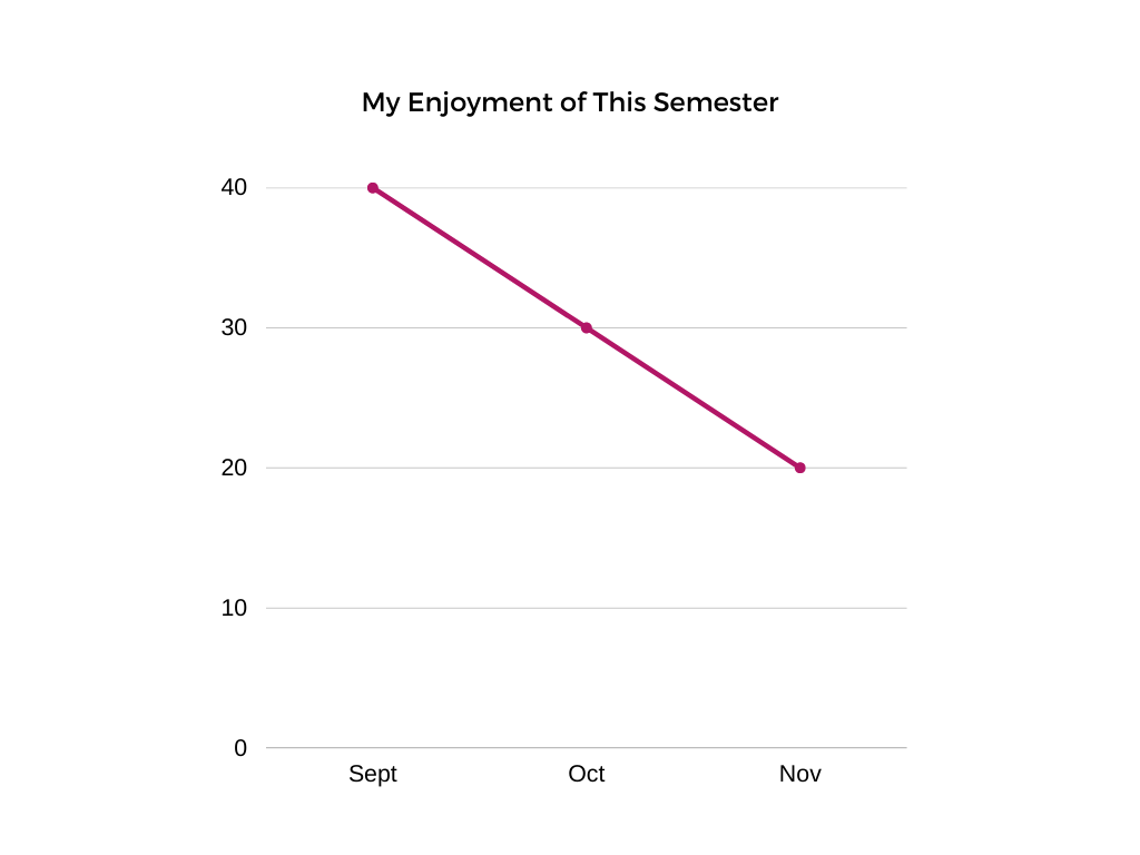
Data visualization simplifies complex information, transforming it into easily comprehensible and visually appealing charts and graphs that enable users to quickly gain insights and make informed decisions.
Animations on a website capture the userrs attention, making the content more visually compelling and helping to convey information and navigate the site.
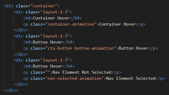
Container Hover
Nav Element Not Selected
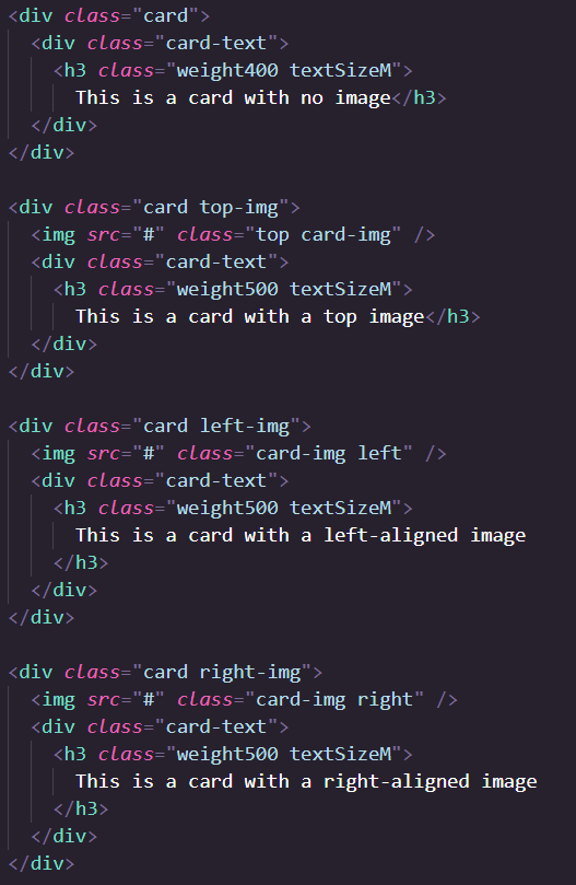
Cards can be used for displaying data in a clean and organized way. Below are some examples of different card layouts.
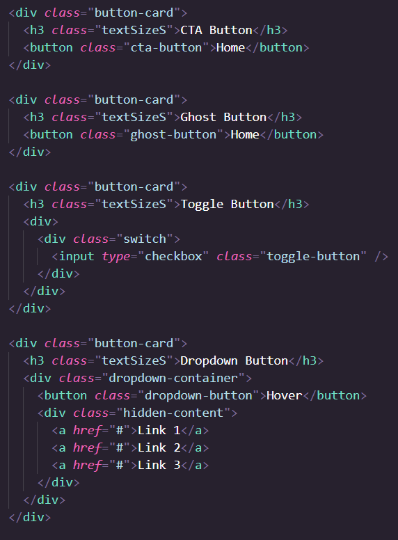
Simple toggle switches for enabling and disabling options.
        label class="switch">
        input type="checkbox">
        span class="slider">/span>
        /label>

        label class="switch">
        input type="checkbox">
        span class="slider round">/span>
        /label>
Horizontal and vertical site navigation bars.
                        div class="hNav">
                        a href="#">img src="./images/CTVIcon.png" alt="logo">/a>
                        a href="#">Home/a>
                        a href="#">Data/a>
                        a href="#">Contact Us/a>
                    /div>

                    div class="vNav">
                        a href="#">img src="./images/CTVIcon.png" alt="logo">/a>
                        a href="#">Home/a>
                        a href="#">Data/a>
                        a href="#">Contact Us/a>
                    /div>
Icons play an important role for the user to navigate around the website, and is therefore important that they are recognizable, simple, and visually appealing.
class= "iconSample iconSize"
src= "images/home.png" >
class= "iconSample iconSize"
src= "images/profile.png" >
class= "iconSample iconSize"
src= "images/menu.png" >
class= "iconSample iconSize"
src= "images/search.png" >
class= "iconSample iconSize"
src= "images/settings.png" >
class= "iconSample iconSize"
src= "images/microphone.png" >
class= "iconSample iconSize"
src= "images/credit_card.png" >
class= "iconSample iconSize material-symbols-outlined" >
developer_buide
class= "iconSample iconSize material-symbols-outlined" >
apps
class= "iconSample iconSize material-symbols-outlined" >
brush


The CommandTV logo is a symbol of who we are that is displayed across our website.
a
href= "#Typography" >
img
class= "icon"
src= "images/CTVIcon.png" >
/a >
h1
class= "textSizeL" > Command TV Pattern Library / h1 >
id= "home" >
class= "hero" >
class= "textSizeM weight500" > Welcome to Our Pattern Library, / p >
class= "textSizeXXL weight500" > Explore our design guidelines and components for building a beautiful web application / p >
a
href= "#Typography"
class= "cta-button textSizeM weight500" > Get started / a >
/div >
img
src= "images/CTVIconWhite.png" >
/div >
a
href= "#Typography" >
img
class= "icon"
src= "images/CTVIcon.png" >
/a >
div >
class= "exampleHeader"
About CommandTV
/div >
p
class= "aboutCommandtv" >
About CommandTV Description
/p >
! -- Copyright -->
span >
div >
class= "copyright"
Copyright © 2023/ div >
div >
class= "commandTV"
CommandTV/ div >
/span >
Welcome to Our Pattern Library,
Explore our design guidelines and components for building a beautiful web application
Get Started
Flexbox is a CSS web layout that allows for easier placement of objects in columns and rows
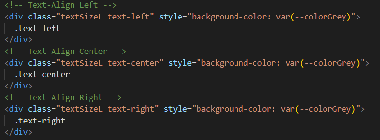
Text alignment allows for the adjustment of inline content in block elements or table-cells on the x or y axis
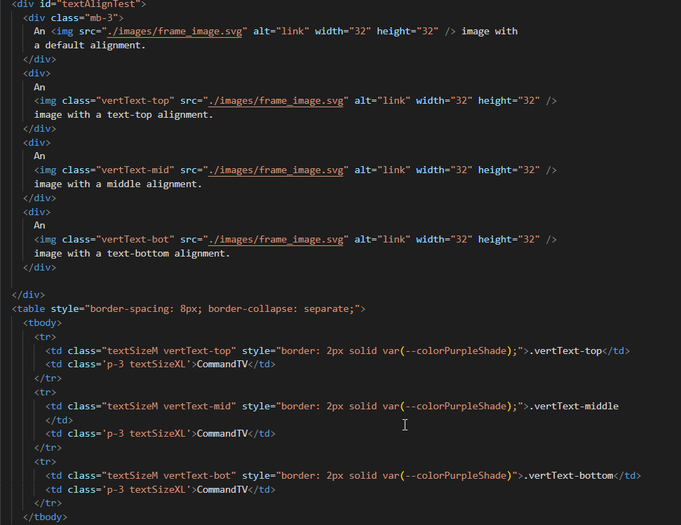
 image with
a default alignment.
image with a text-top alignment.
image with a middle alignment.
image with a text-bottom alignment.
image with
a default alignment.
image with a text-top alignment.
image with a middle alignment.
image with a text-bottom alignment.
| .vertText-top | CommandTV |
| .vertText-middle | CommandTV |
| .vertText-bottom | CommandTV |
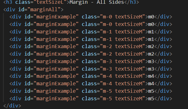
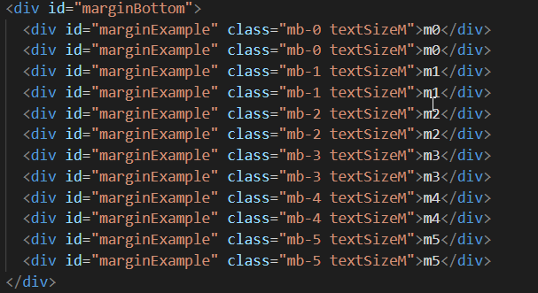
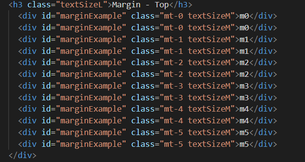
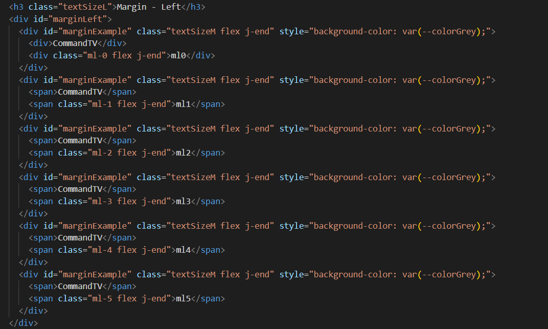
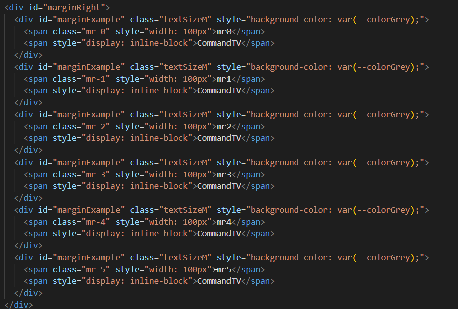
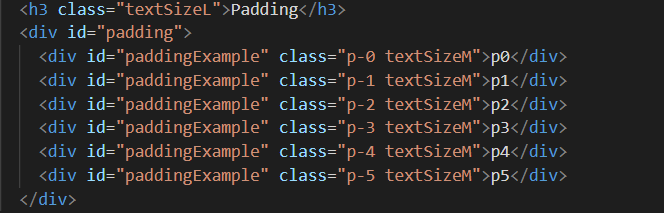
Classes for margin and padding help keep spacing consistent.